Opportunities for incremental interaction improvement
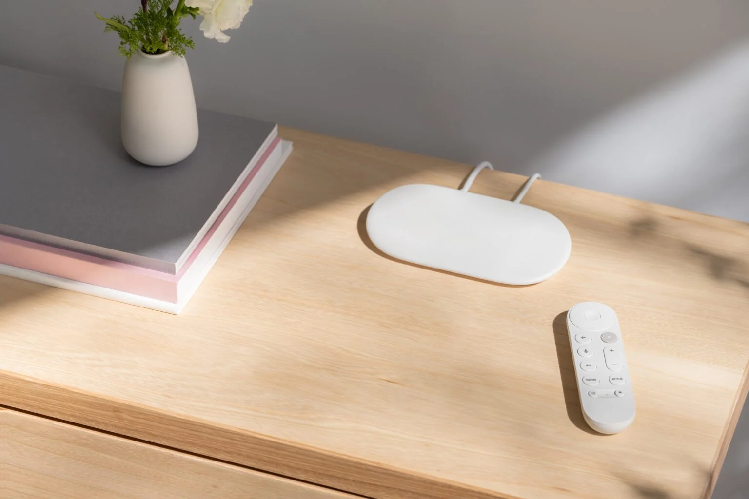
Google TV Streamer
Google TV Streamer
Opportunities for incremental interaction improvement
Google TV Streamer & Remote
Google TV Streamer & Remote
Overview | Opportunity
Upon joining the project mid-cycle, I conducted a rapid UX audit to identify high-impact refinement opportunities and pivoted from a role of maintaining parity to one of active improvement. Despite significant hardware and software constraints, I pushed for optimization of button interactions and interface layouts to meet higher accessibility standards and leverage the newly established physical UX best practices.
Role
Physical UX Designer | Device Interaction Design
HW/SW Interactions, Cross-Functional Alignment, User Flows, Prototyping & Testing, User Research
CHALLENGES
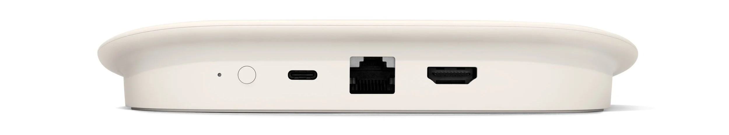
Technical: Work within existing Android remote foundational framework
UX: Enhance button (combo) press accessibility
UX: Develop a monochromatic light language for 13 remote states
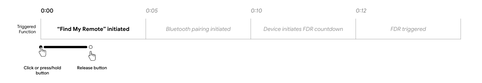
UX: Map 6 inputs to a single streamer button

APPROACH
1 | Monochromatic Indication
With the program already committed to a single, white LED, the remote presented a unique challenge: applying my recently established, Google-wide design patterns in a strictly monochromatic format. Accomplishing this required distilling my existing principles down even further and performing additional user validation testing.

First, I created compatibility check requirements for a single LED per feature set – confirming what and how multicolor flows could work in a monochromatic implementation.
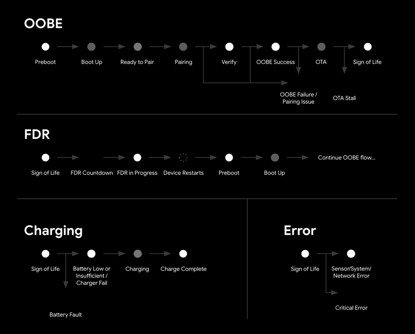
Next, I worked through critical flows to ensure no duplicative, sequential animation states within individual flows or across flows that could lead to status misinterpretation.
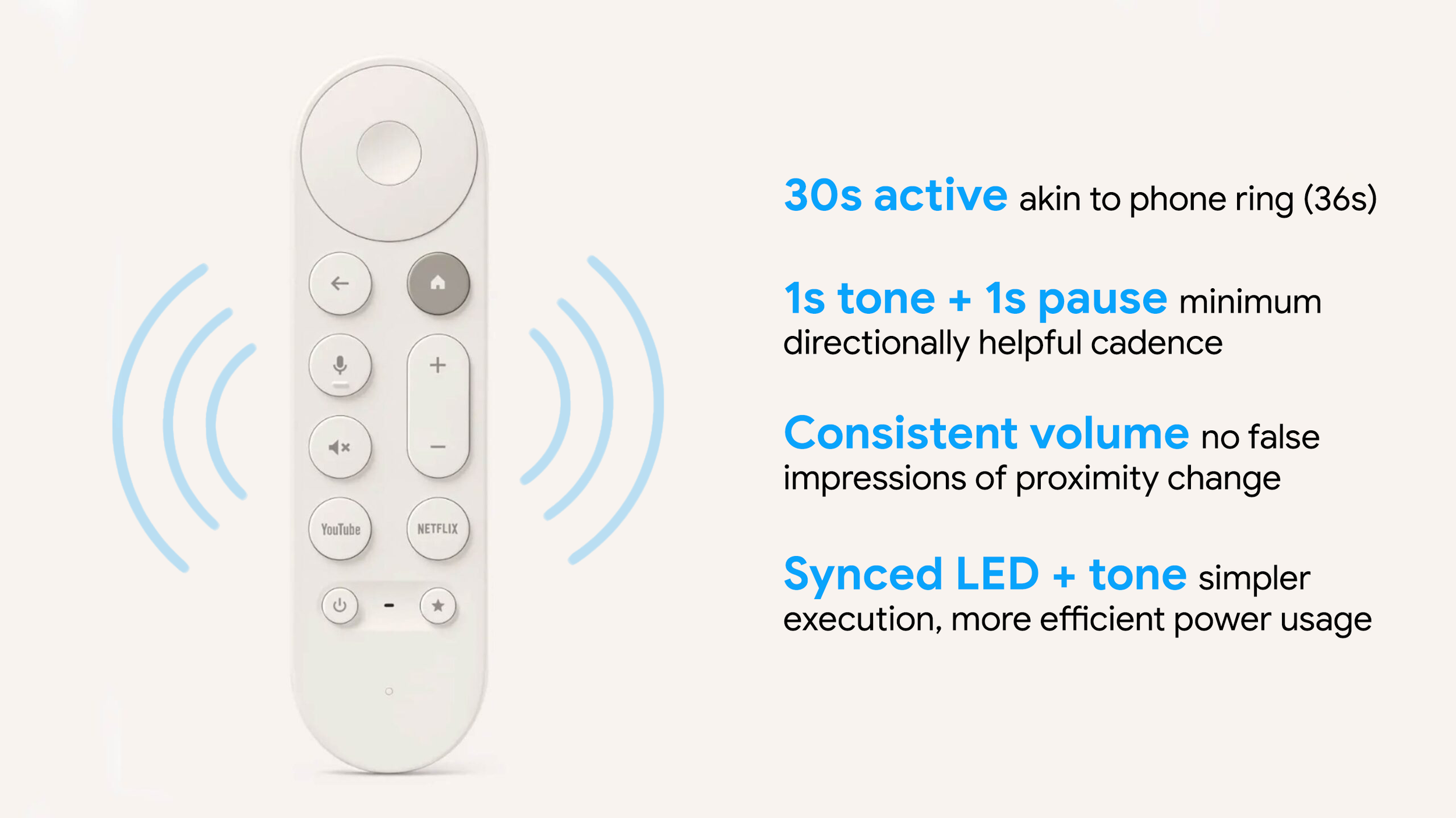
2 | Find My Remote
The integration of the new Find My Remote feature into the streamer button mapping, much like the remote LED, was complex technically and logistically, but ultimately resulted in full alignment with the new button usage standards. The ability of nearly every tester – including all project stakeholders – to correctly execute all three button-triggered functions without instruction made flow validation a trivial formality.
On the remote side of this new feature experience, I partnered with Audio UX and Software Engineering teams to strike a balance between informative audio cues and battery efficiency.
3 | Accessibility Improvements
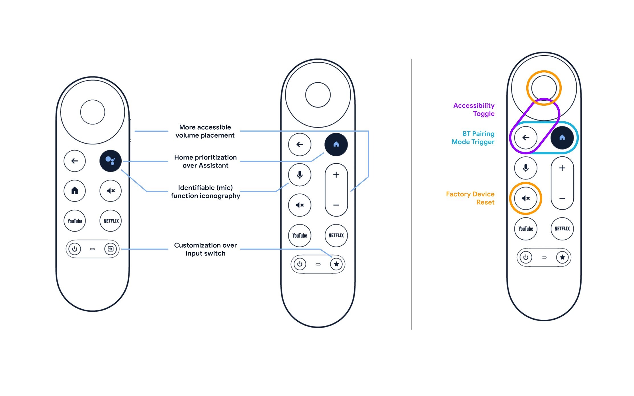
While assisting in the ergonomic redesign of the remote, I pushed for a reexamination of the button layout. In addition to championing more intuitive placement and indication for priority buttons, I identified that more intentional button selection for multi-input feature triggers significant improved remote accessibility. While existing software commitments prevented the full proposal rollout, a clear roadmap to guide future enhancements was created and notable refinements were implemented.
IMPACT
A more ergonomic design and layout, touted as “a great remote update [that] gets all the little things right” and the successful implementation of a long sought-after Find My Remote feature to address the most common user complaint.
Full application (and validation) of new visual and tactile affordance standards, helping create a clear roadmap for future accessibility improvements.
“Directly Addresses the ~70% of Users Who Misplace Their Remote At Least Once a Week”