Overview | Problem
Upon joining Google, I quickly identified that each product category made exceptions and digressions from the existing [rough] guidelines for their devices, resulting in a disjointed ecosystem with notable friction when moving between LED mental models across products.
Over the next year I created a holistic, vetted, and cross-functionally aligned set of standards for LED implementation to improve perception across all of hardware that I continue to evolve and champion across product areas and new products.
Google LED Standards
Google LED Standards
Google LED Standards
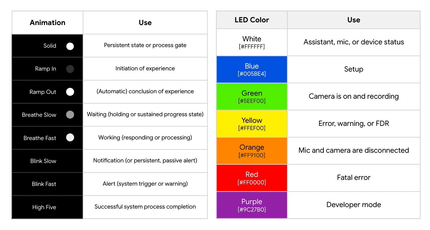
An ecosystem of consistent meaning
Google LED Standards
Role
Lead UX Designer | Device Interaction Design
HW/SW Interactions, Cross-Functional Alignment, User Flows, Prototyping & Testing, User Research, Motion Graphics, LED Calibration
APPROACH
1 | Google-wide Audit
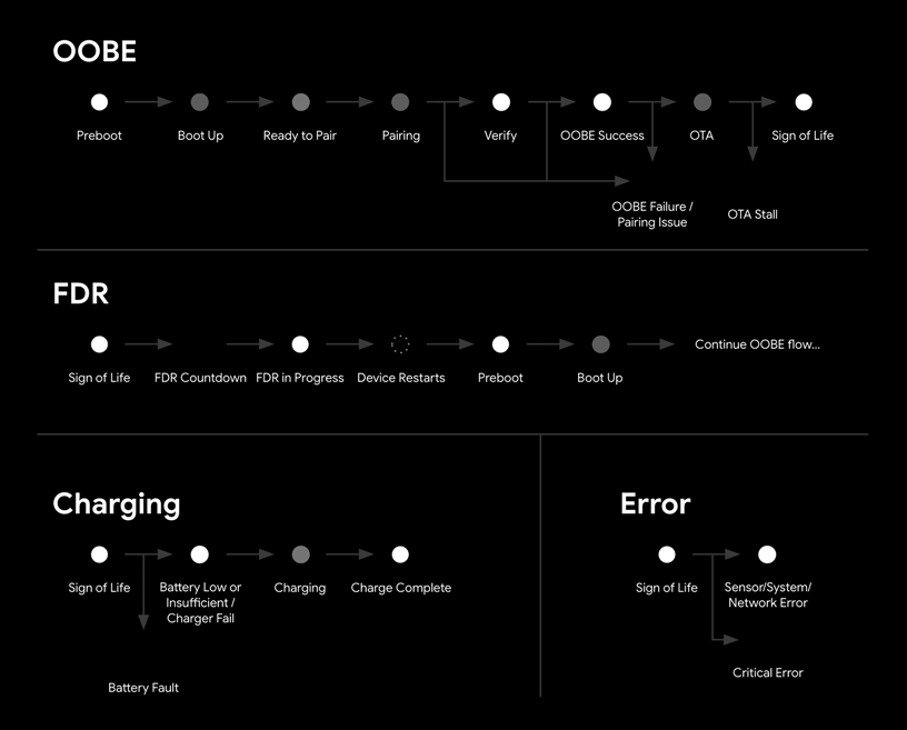
Every unique LED state on over 30 launched and 8 in-development products was catalogued to establish existing trends and understand divergent behaviors. These were synthesized into essential patterns and aligned on internally.
2 | State Distinction
The redesign goal was to prioritize clear communication of general intention over a specific meaning – for example, knowing when something is wrong versus knowing exactly what is wrong. Every animation pattern was reassessed and simplified to be easily distinguishable, trimming 21 existing patterns down to 12 essential ones.

3 | Global Perception Research
The proposed standards were put through an extensive, global validation study, mitigating any cultural bias to ensure intuitive and easily identifiable LED states without requiring extensive user education.


I presented design findings to stakeholders utilizing both objective data and contextual subjectivity, ensuring core elements aligned with clear trends while allowing for situational adaptations as necessary per device.
A prime example is the Pixel Buds case: due to its white finish and frequent usage in direct sunlight, the standard yellow low-battery indicator lacked sufficient contrast. We strategically addressed this by adjusting yellow to be a darker amber, significantly improving color visibility and legibility under bright conditions while maintaining the intended "slightly negative/alerting " user sentiment associated with that area of the color spectrum.

APPLICATION
1 | Color Definition
After identifying a direct conflict between how Pixel and Nest visually communicated microphone states, I navigated the priorities and stances of cross-functional teams to align on color application using the newly established LED design principles. Green now always indicates an active sensor across all Google products on UI and hardware affordances, with orange reserved for privacy states.

2 | Unnecessary States
A secondary outcome of the light language realignment was the strategic reduction of device light usage, directly addressing user frustration with ambient light pollution in dark environments. By eliminating LEDs used to indicate "normal" or quiescent device states, the clarity and impact of necessary light communication is enhanced. This approach ensures that when a light is active, it is intentional, attention-grabbing, and successfully communicates an urgent device status. [It also reduces energy drain.]

3 | Monochromatic Alternative
Noting concerns/requests from Engineering and PM teams, a secondary tier of the light language was developed to support products with rigid hardware and cost constraints. This system accommodates an ~80% reduction in available LED states by being restricted to devices with low interaction complexity. The resulting language maintains coherence with the primary system by prioritizing consistent animation sentiment rather than rigid one-to-one translation of specific interaction states.
An ecosystem of consistent meaning
4 | Evolving Identity
The transition to Gemini branding required guaranteeing consistent implementation across all product surfaces while simultaneously defining the new visual identity, involving intense cross-functional collaboration to address all technical constraints. A key achievement was partnering directly with Engineering to solve the challenge of accurately rendering Gemini’s subtle blue-to-pink gradient on older, hardware-constrained 4-LED devices by leveraging existing color calibration targets in a novel way.
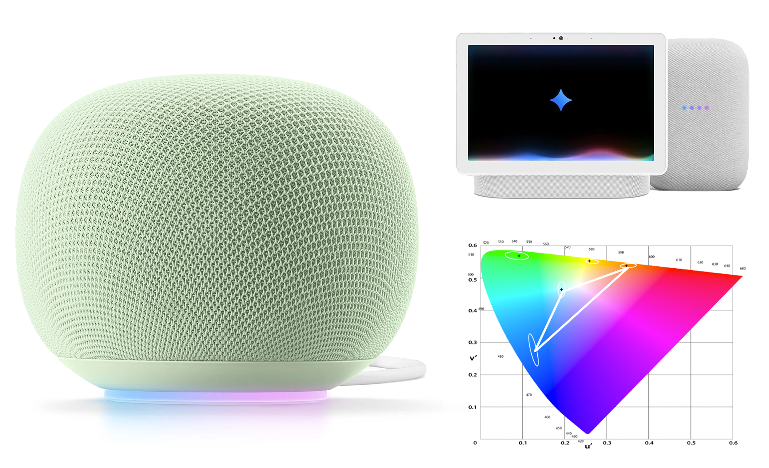
Validation testing of new Gemini colors applied retroactively to the Nest Audio speaker.
[Note: LEDs are notoriously hard to accurately capture on video, but the general impression remains clear.]
IMPACT
These vetted standards decrease the cognitive load of LED mental models through simplified patterns, highly intentional usage (or abstinence) of light, and consistency across all Google products. They also both reduce questions to the Support Team about LED meaning and require less esoteric, product-specific knowledge.
With consensus reached, these principles were easily applied to straightforward scenarios and are used to navigate conversations around larger impact and more novel efforts as they arise.
“72% drop in LED-related customer support issues”