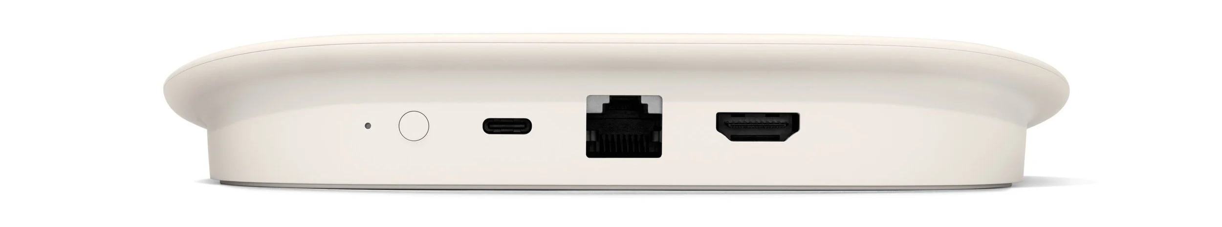
Google TV Streamer & Remote
Results
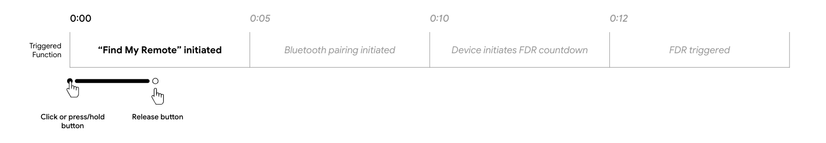
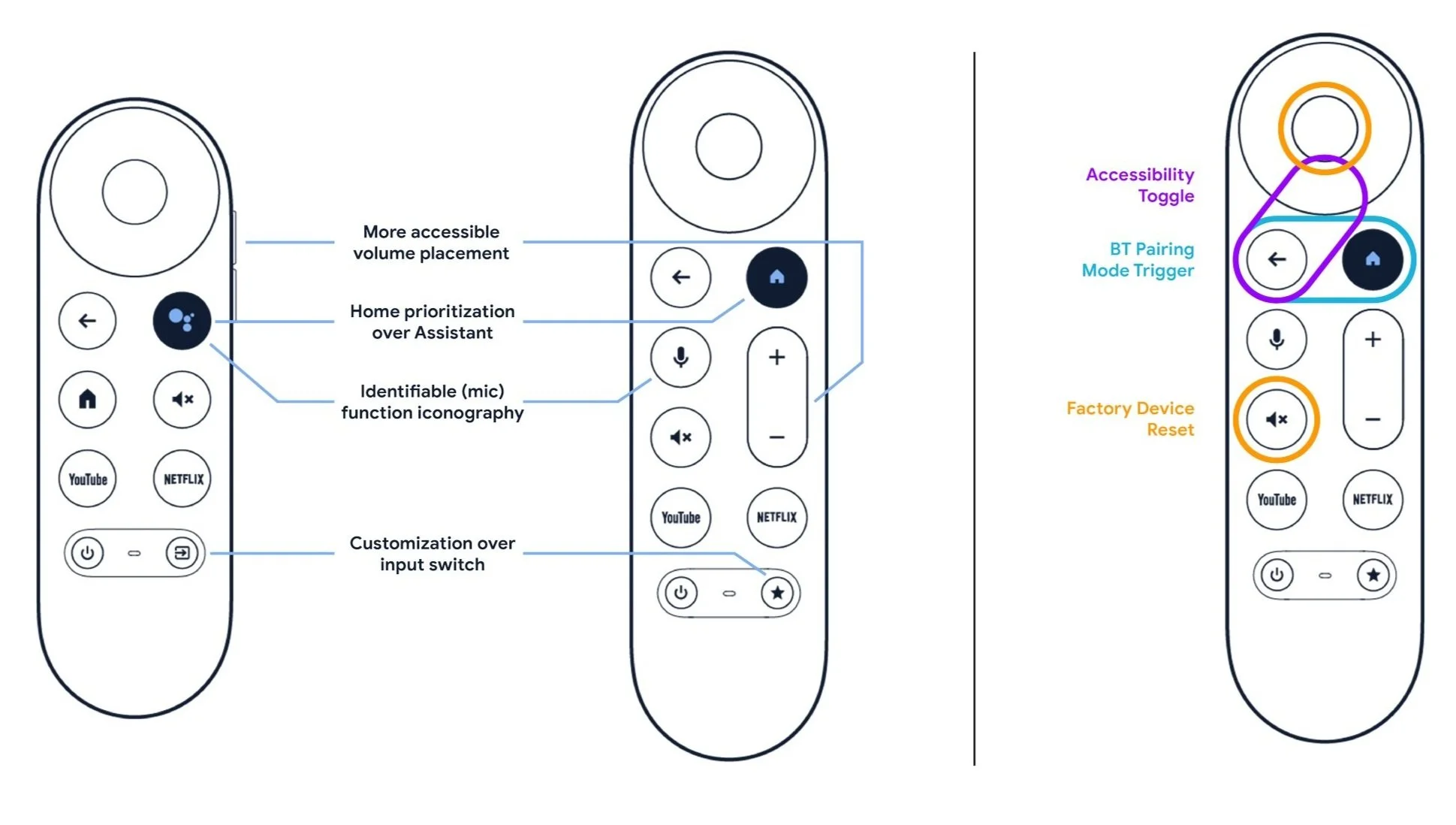
A more ergonomic design and layout, touted as “a great remote update [that] gets all the little things right” and the successful implementation of a long sought-after Find My Remote feature to address the most common user complaint.
Full application (and validation) of new visual and tactile affordance standards, helping create a clear roadmap for future accessibility improvements.
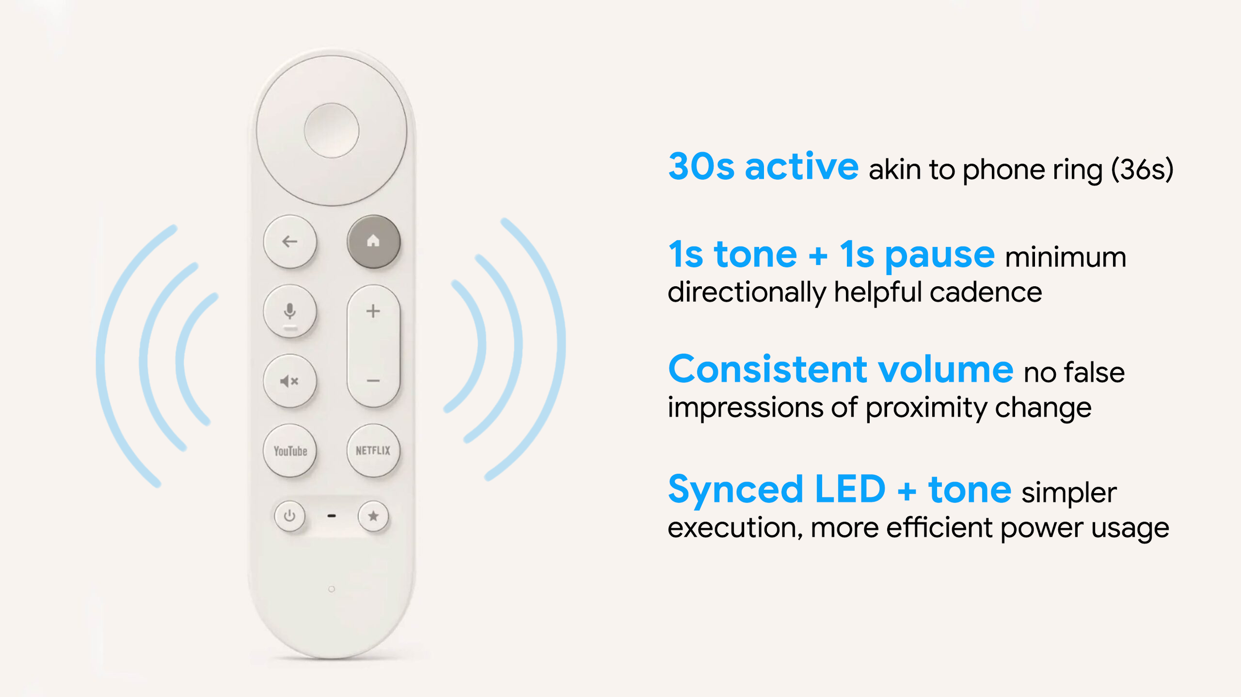
“Directly Addresses the ~70% of Users Who Misplace Their Remote At Least Once a Week”
Task | Button It Up
Enhance button interactions and layout to follow aligned UX standards, adhere to accessibility guidelines, and leverage new feature capabilities.

Challenges
Enhance button (combo) press accessibility.
Work within existing Android remote foundational framework.
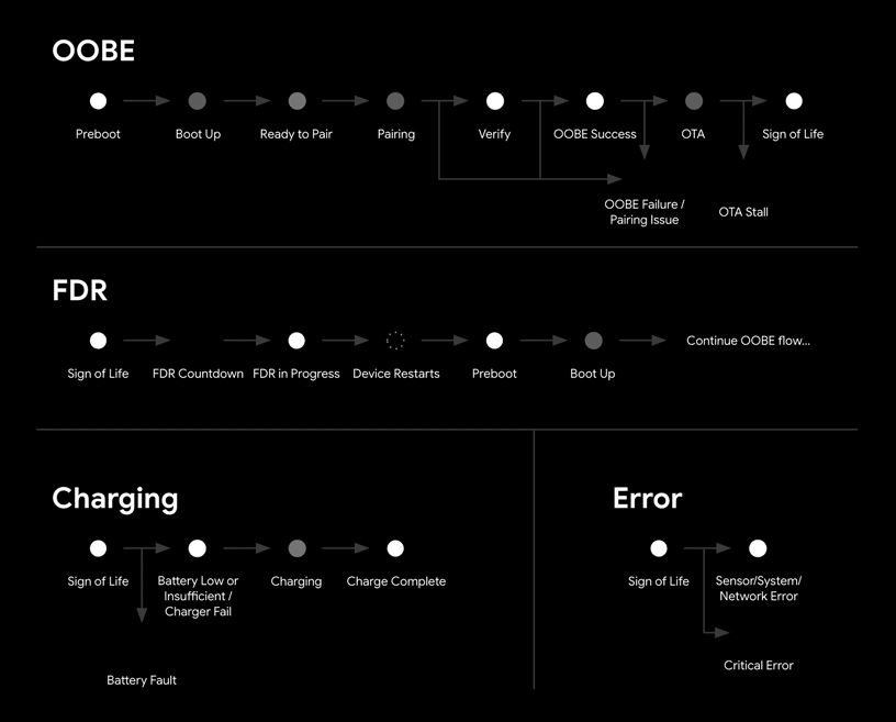
Develop a monochromatic light language for 13 remote states.
Map 6 inputs to a single streamer button.
With a single, white LED, the remote presented a unique challenge: Applying my recently established, Google-wide design patterns in a strictly monochromatic format.

Compatibility check with a single LED per feature set – confirming what and how multicolor flows could work in a monochromatic implementation.
Critical flows comparison to ensure no duplicative, sequential animation states within individual flows or across flows that could lead to status misinterpretation.