Systems & Strategy
Results
My approach to design, even in tactical tasks, involves a holistic perspective, allowing me to understand the broader impact of each change. This bird's-eye view has consistently led to the creation of streamlined workflows and improved collaboration across teams.
By carefully considering the limitations and constraints faced by all stakeholders, I develop considerate and efficient systems that enhance both productivity and the overall quality of work.
“Now I can actually focus on the important stuff.”
Google-wide LED Best Practices
I quickly identified that each product category made exceptions and digressions from the existing guidelines for their devices, resulting in a disjointed ecosystem. Over the next year I created a holistic, vetted, and cross-functionally aligned set of standards for LED implementation to improve perception across all of hardware.
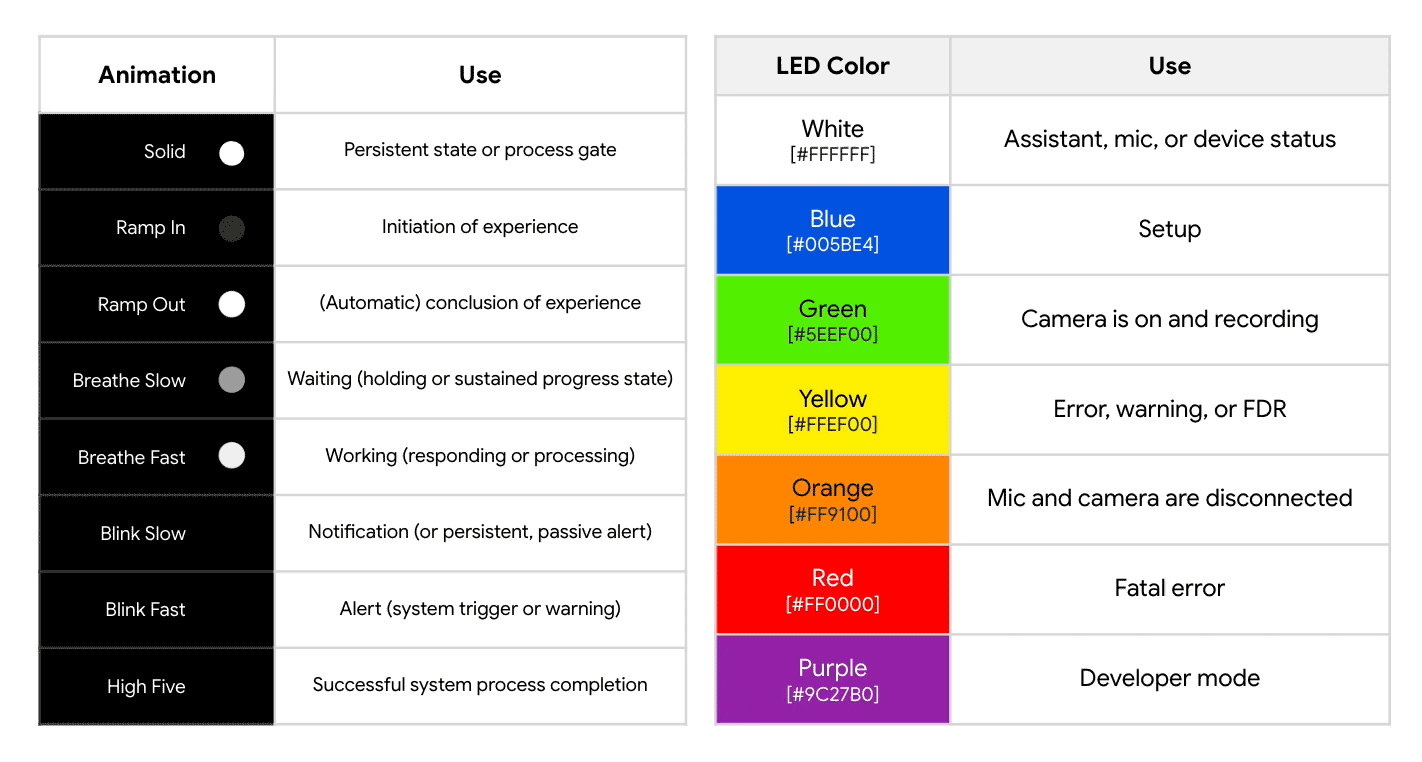
Google-wide Audit | Every unique LED state on over 30 launched and 8 in-development products was catalogued to establish existing trends and understand divergent behaviors. These were synthesized into essential patterns and aligned on internally.

Global Perception Research | The proposed standards were put through an extensive, global validation study, mitigating any cultural bias to ensure intuitive and easily identifiable LED states without requiring extensive user education.
These vetted standards decrease the cognitive load of LED mental models through simplified patterns, highly intentional usage (or abstinence) of light, and consistency across all Google products. They also both reduce questions to the Support Team about LED meaning and require less esoteric, product-specific knowledge.

State Distinction | The redesign goal was to prioritize clear communication of general intention over a specific meaning – for example, knowing when something is wrong versus knowing exactly what is wrong. Every animation pattern was reassessed and simplified to be easily distinguishable, trimming 21 existing patterns down to 12 essential ones.

Color Definition | After identifying a direct conflict between how Pixel and Nest visually communicated microphone states, I helped align cross-functional teams on color application using the newly established LED design principles. Green now always indicates an active sensor and Orange a blocked sensor.
Smartwatch GUIs
At Fossil, I led three custom OS initiatives, overseeing all GUI development. Each experience was crafted by integrating user needs, cross-brand objectives, and engineering constraints to ensure a perfectly tailored, unique device interface.
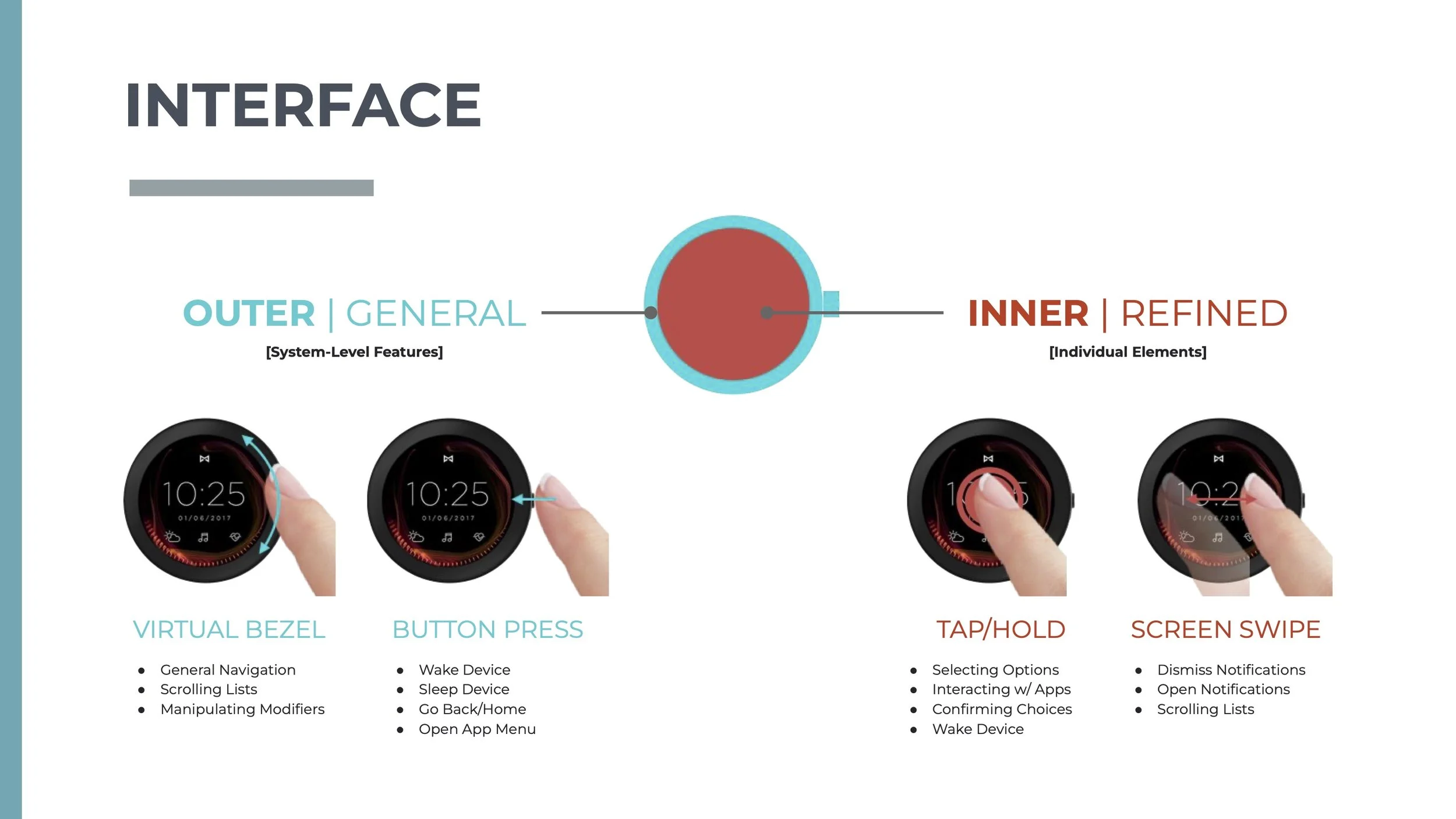
Vapor
Focus: Utilize the “dead space” around the screen edge to create a more intuitive and forgiving circular touch interface.
Outcome: Deemed a “credible threat” to WearOS by their own analysis. Key system features were ultimately integrated into WearOS.

Hybrid
Focus: Build out a more “affordance-driven” framework for the GUI reimagining.
Outcome: Launched on Fossil’s Gen 6 devices and praised for the more intuitive interface, particularly the adherence to the form and button inputs. (Left Fossil prior to implementation.)

Kiwi
Focus: Embrace the strengths and weaknesses of an MIP display to create a “lifelong” smartwatch, in line with Fossil’s traditional watch identity.
Outcome: Fully vetted by Engineering and lauded by leadership as “essential" to long term success, but deprioritized due to issues on existing platforms.
Energy Consumption Reduction
During development of the Nest Wifi Pro, I identified and championed a change to the "Sign of Life" LED state to be OFF by default, aligning with our established principle of surfacing LEDs only when needed. This not only simplified LED pattern mental mapping and reduced in-home light pollution, but also saved approximately ~1.5-2% of idle energy consumption. Even though the energy saved per device seemed “negligible” to the individual unit/user, it became significant across millions of units.


Values are best-case estimates made during development.
Along with highlighting these savings, I illustrated the overall UX benefits and validated the approach with UXR & Engineering to secure stakeholders buy-in despite the proposal’s break from the always-on LED market standard. I used this as a baseline to pursue similar energy-saving LED optimizations for other Nest/Google devices in development, such as the Google TV Streamer (4k).


Values are best-case estimates made during development.
Brand Watch Face Creation
Single-handedly created and managed the components, style guides, and templates for digital watch face creation supporting 11 international brands and +50 designs simultaneously. Prior to taking the initiative to create a more streamlined and cross-functionally aligned process, every brand would submit designs in entirely different formats, requiring days of additional work per design translating brand intent into actionable Software Engineering directives.


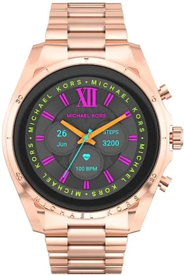


The UX system design needed to be flexible: able to maintain brand intent and consistency across devices while adapting to evolving hardware requirements for each smartwatch model as well as the constantly evolving software guidance from our WearOS partners. The optimized approach ultimately reduced watch face creation from 3 months of work to just 2 weeks on average.